The text on your YouTube thumbnail is often the deciding factor between a click and a scroll-past. Text on youtube thumbnail has to do two things simultaneously: be legible at 320×180 pixels (search result size) and look intentional and professional. These are the best practices for youtube thumbnail text in 2026, based on what high-performing channels consistently use.
Key Takeaways
- Use bold, thick-stroked sans-serif fonts — they read at any size
- 3-5 words is the sweet spot for thumbnail text
- Text should occupy 30-50% of the thumbnail width for good readability
- Place text in the top-left or top area for maximum visibility (YouTube overlays duration in bottom-right)
- Always add a dark stroke or drop shadow to white text (and vice versa) for contrast
- The best font for thumbnails depends on your niche — entertainment uses thick display fonts, education uses cleaner sans-serifs
Why Text on Thumbnails Works
Thumbnail text does one thing that images alone can’t: it gives the viewer specific information. An image shows a surprised face — text clarifies whether that’s “I LOST $10,000” or “BEST VACATION EVER.” The combination of visual + text creates a complete message in under a second, and YouTube’s own Creator Academy recommends pairing custom thumbnails with strong, descriptive titling for exactly this reason.
Studies analyzing top YouTube channels in 2025-2026 show that 70-80% of videos on the first page of competitive searches use thumbnail text. The minority of thumbnails without text tend to be from channels with very strong brand recognition where the face or visual alone drives clicks.
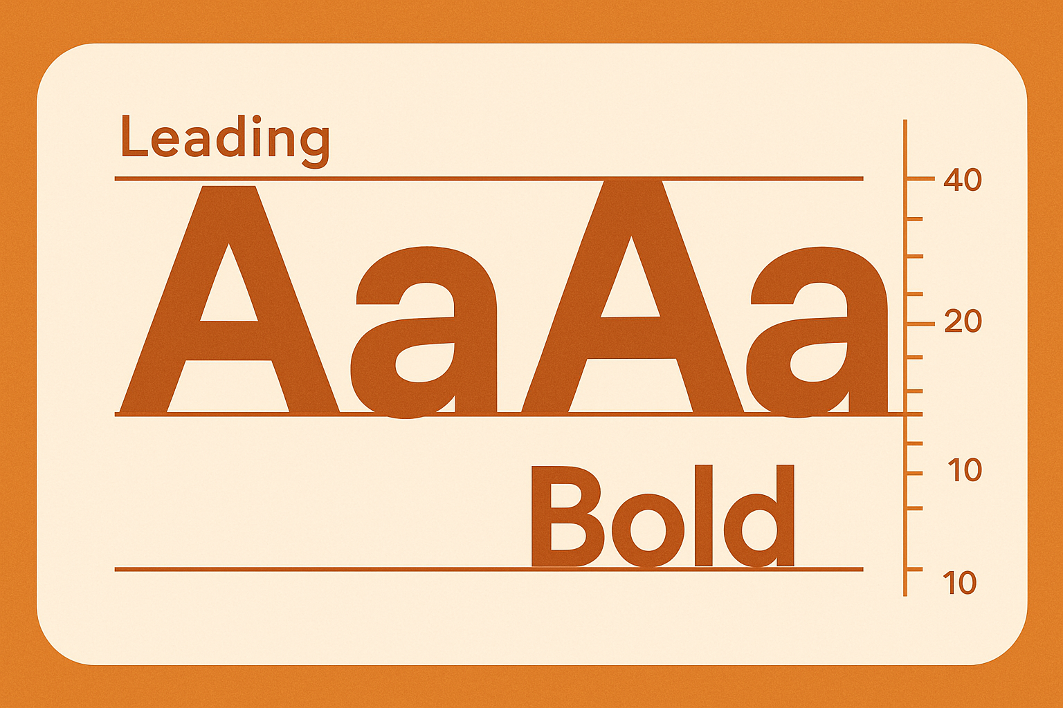
The Best Fonts for YouTube Thumbnails
Display Fonts (Highest Impact)
These fonts are built for large, bold applications:
- Impact: The classic YouTube thumbnail font. Wide, heavy, extremely legible at any size. Often condensed, which means it fits more text in less horizontal space.
- Anton: Google Font, similar to Impact but slightly more refined. Free to use.
- Bebas Neue: Clean, all-caps display font. Very popular in fitness, sports, and tutorial content. Free on Google Fonts.
- Oswald Bold: More versatile than Bebas Neue — works at various weights. Free on Google Fonts.
Bold Sans-Serif (Versatile)
- Montserrat ExtraBold/Black: Clean, modern, widely used in tech and business content.
- Poppins Bold/ExtraBold: Rounded, friendly — works well for lifestyle and educational content.
- Nunito Extra Bold: Softer edges, good for food, travel, and positive/uplifting content.
Fonts to Avoid on Thumbnails
- Script or handwritten fonts: Unreadable at small sizes
- Light or thin weight fonts: Disappear against any background
- Serif fonts (Times New Roman, Georgia): Too formal, poor legibility at small sizes
- Decorative/novelty fonts: Often clever in isolation but illegible in a busy feed
thumbnail font youtube: Size Guidelines
On a 1280×720 canvas:
| Text Hierarchy | Recommended Height | Purpose |
|---|---|---|
| Primary text | 100-140px | The main message — must be readable at small sizes |
| Secondary text | 60-80px | Supporting context (number, result, or keyword) |
| Channel branding | 30-50px | Optional watermark |
Text smaller than 60px on a 1280×720 canvas becomes unreadable when YouTube displays the thumbnail at 320×180 (search result size).
Best Placement for Thumbnail Text
Top-Left Placement (Most Common)
The top-left corner is where Western viewers’ eyes naturally land first. Placing your most important text here:
- Ensures it’s seen before the image
- Avoids YouTube’s duration badge (bottom-right)
- Creates a visual anchor for the rest of the thumbnail
Center-Top Placement
Works when the image subject is in the lower half (a product, a scene, or a person standing). Text at the top reads immediately.
Avoid the Bottom-Right Corner
YouTube displays the video duration (e.g., “12:45”) in the bottom-right of every thumbnail in the feed. Any text or important visual element in that area will be partially covered.
The “Left Side, Subject Right” Layout
One of the highest-performing YouTube thumbnail layouts:
- Person/face on the right side of the frame, making eye contact with viewer
- Bold text on the left side
- High-contrast background behind the text
This separates the text and image visually, making both more readable.
Adding Strokes and Drop Shadows
Raw white text over a photo background is often unreadable because there’s no consistent contrast. The solution:
Stroke/outline: Add a 5-10px black stroke around white text (or a white stroke around dark text). This is the most common approach in gaming, entertainment, and tutorial thumbnails.
Drop shadow: A subtle dark drop shadow behind text works for more polished designs. Use a 4-8px distance and 80% opacity for best results.
Text box/background pill: Place a semi-transparent dark box behind the text. This creates excellent contrast regardless of what’s behind it.
Color Contrast for Thumbnail Text
The bare minimum for readable thumbnail text is a 4.5:1 contrast ratio (WCAG AA standard). In practice, thumbnail text works best at 7:1 or higher:
- White text (#FFFFFF) on black stroke: very high contrast
- Yellow (#FFD700) on dark background: excellent contrast, high energy
- White on pure red: borderline — add a darker stroke
- Light gray on white: unreadable — avoid
Common Thumbnail Text Mistakes
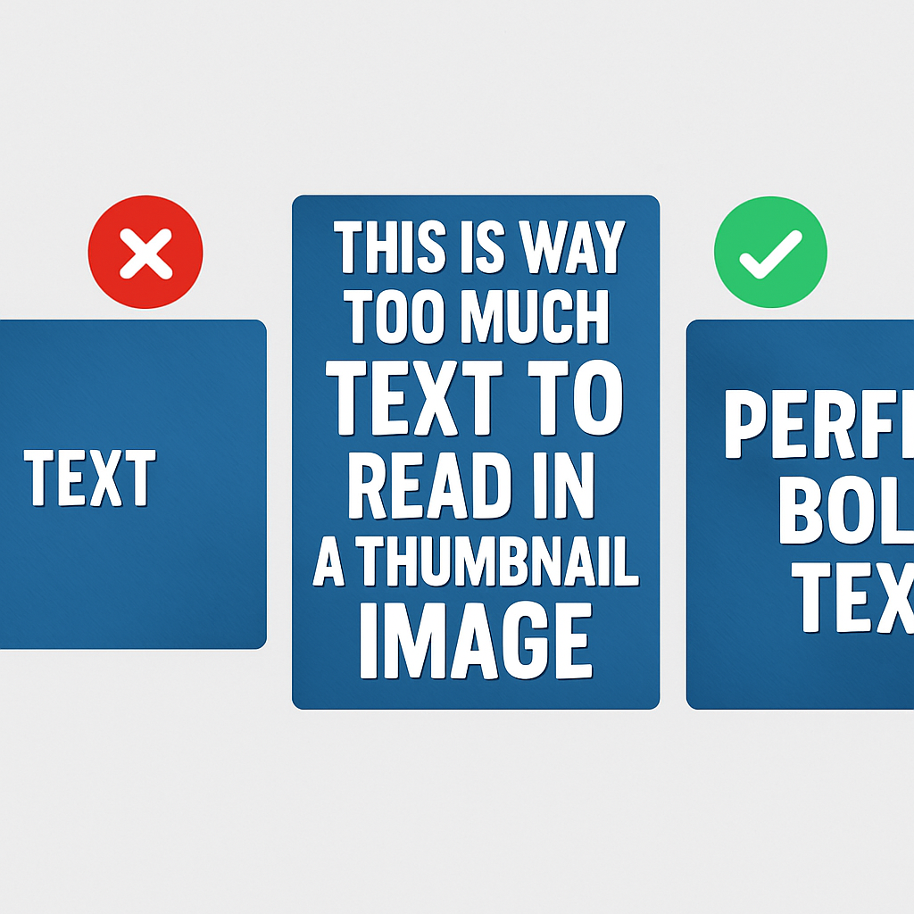
- Too many words: More than 5-7 words is unreadable at small sizes
- All lower case: Uppercase or Title Case reads faster on thumbnails
- No contrast from background: Light text on light background or dark text on dark background
- Multiple different fonts in one thumbnail: Looks amateur; stick to one font family with different weights
- Text touching the edges: Leave at least 60-80px margin from every edge
Conclusion
The best youtube thumbnail text approach in 2026 is: bold display font, 3-5 words, high contrast with stroke or drop shadow, placed in the top or left areas away from YouTube’s duration overlay. Fonts like Impact, Anton, Bebas Neue, and Montserrat ExtraBold are proven performers across niches.
For broader thumbnail design guidance, see How to Make YouTube Thumbnails That Get Clicks — which covers the full picture including colors, faces, and composition strategy.
For a reference on what size canvas to design on, see the YouTube Thumbnail Size Guide.