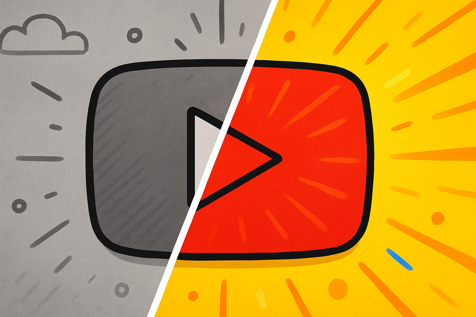
The before and after youtube thumbnail format is one of the most reliably high-performing thumbnail designs across YouTube. Weight loss channels, home improvement, DIY projects, web design, personal finance, and a dozen other niches all use it — because it works. Here’s why this thumbnail comparison format gets clicks and how to use it effectively in 2026.
Key Takeaways
- Before/after thumbnails create an “open loop” — the viewer wants to see the full transformation
- The split screen thumbnail format communicates the video’s value proposition instantly without text
- transformation thumbnail designs outperform generic “talking head” thumbnails in result-oriented niches
- The before state should look clearly worse (or different) from the after — contrast is the point
- You don’t need equal before/after space — a 40/60 or 30/70 split can work better depending on the content
Why Before/After Thumbnails Work Psychologically
The before/after format exploits a fundamental aspect of human psychology: the desire for resolution. When a viewer sees a clear “before” state, their brain automatically wants to know what the “after” looks like. This is closely tied to the Zeigarnik effect — the tendency for unfinished situations to occupy more mental attention than completed ones — and creates an open loop that can only be closed by clicking the video.
Additionally, the format instantly communicates:
- What problem you’re solving (the before state)
- That you have a solution (the after state exists and looks better)
- The magnitude of the change (visible transformation)
All of this happens in under a second, which is all the time thumbnails get in a busy feed.
Best Niches for Before/After Thumbnails
This format works particularly well in:
- Weight loss / fitness: Before body vs after body (within platform guidelines)
- Home improvement / DIY: Messy room vs clean room, broken item vs repaired
- Web design / coding: Ugly website vs professional redesign
- Personal finance: Debt screenshots vs debt-free dashboards
- Skincare / hair: Problem skin/hair vs clear/styled result
- Food / cooking: Raw ingredients vs finished dish
- Design tutorials: Rough draft vs polished final
- Relationship / productivity: Before (stressed, chaotic) vs after (calm, organized)
The common thread: any content where a transformation, improvement, or comparison is central to the value of the video.
How to Design a High-CTR Before/After Thumbnail
Layout Options
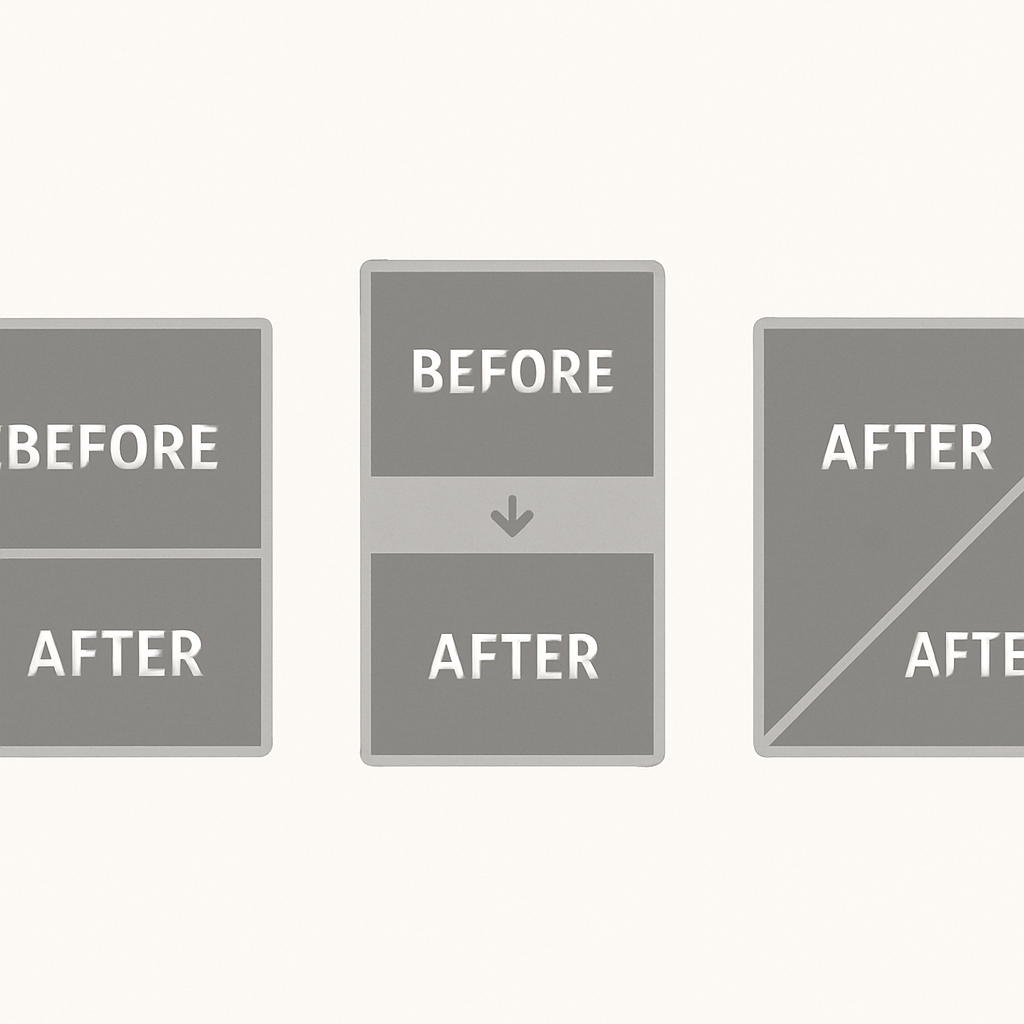
Split screen vertical (50/50):
- Divide the thumbnail exactly in half vertically
- Place the “before” on the left, “after” on the right
- Add a clear dividing line or arrow between them
- Optional: add small “BEFORE” and “AFTER” labels
Before in corner, after dominates:
- Show a smaller, degraded before image in one corner
- Make the after image the dominant 70-80% of the frame
- This emphasizes the positive transformation
Arrow/progress format:
- Before on the left with an arrow pointing right to the after
- Works well when the visual difference is stark
Visual Contrast Rules
The before/after format only works if the contrast is obvious at thumbnail size. Guidelines:
- Color temperature: Before should look cooler or more neutral; after should look warmer and brighter
- Lighting: Before should look dimly lit or flat; after should look well-lit and vibrant
- Context markers: Use time/date stamps, arrows, or labels to clearly indicate which side is which
- Don’t make the “after” too subtle: Viewers should immediately see improvement, not squint to compare. Per YouTube’s thumbnail guidelines, thumbnails should accurately represent the content — exaggeration that misleads viewers can hurt long-term performance
Text in Before/After Thumbnails
Since the image communicates the transformation, text in these thumbnails is often optional or minimal:
- A number can be powerful: “6 WEEKS,” “$50,000 PAID OFF,” “100 LBS”
- “BEFORE vs AFTER” as a tiny label is sometimes helpful for clarity
- Avoid excessive text — the visual is the story
thumbnail comparison format: Common Mistakes
- Before and after look almost the same: If the contrast isn’t obvious, the open loop isn’t created
- Too small on one side: If the before image is too tiny to be understood, the comparison is lost
- Using before/after for content that doesn’t actually show transformation: Misleading thumbnails damage trust and long-term CTR, and the YouTube Creator Academy consistently recommends accuracy as a foundation of strong CTR
- Cluttering the split with too many elements: The dividing line, two images, and optional text — that’s the limit
The Split Screen Thumbnail Variant
The split screen format is a broader category that includes before/after but also applies to:
- Side-by-side comparisons: Two products, two approaches, two people
- Good vs bad examples: The correct way vs the wrong way
- Then vs now: Historical vs current state
Split screen thumbnails work for the same psychological reason as before/after — viewers want to understand the difference and make a judgment.
When to Use a Different Format
Before/after doesn’t work for every video type:
- Tutorial or educational content without a clear outcome doesn’t lend itself to this format
- Entertainment content (gaming, comedy, reaction) typically performs better with expressive face thumbnails
- News or commentary content often works better with text-forward designs
For broader thumbnail design principles that apply to all formats, see How to Make YouTube Thumbnails That Get Clicks.
Analyzing Before/After Thumbnails From Top Channels
One of the best ways to improve your before/after thumbnails is to study what works in your niche. Download thumbnails from the top-performing videos in your category using the YouTube Thumbnail Downloader and analyze:
- How starkly different are the before and after states?
- Where is the dividing element placed?
- Is there text, and if so, how much?
- What colors dominate each side?
For design tool options, see YouTube Thumbnail Background Ideas which covers background removal and color techniques applicable to before/after designs.
Conclusion
The before and after youtube thumbnail format earns its clicks by exploiting one of the most powerful psychological principles in visual communication: the open loop. Clear visual transformation, strong contrast, and minimal text give this format its consistent high-CTR performance across niches. If your content shows any kind of result or improvement, test a before/after thumbnail against your current design.